
Every movie has a trailer. And admit it or not, you’ve probably judged a movie based on its trailer before you committed to watching the entire two to three hours of film.
So if you ask me what’s the most important part of the book, I’d say it’s the book cover. Just as a dull trailer will entice few moviegoers to see a film, a book cover that misses the mark is likely to sit lonely on the shelf.
Thriller book covers don’t need to be dark all the time—they just need a creative and interesting angle that makes readers want to pick up the book.
10 Chilling Thriller Book Covers
All that said, as the in-house cover designer at TCK Publishing, I’ve compiled a list of some of my favorite thriller covers with explanations of what I think makes them spine-chillingly irresistible.
1. The Silent Patient by Alex Michaelides
What I love about this cover is that it’s not heavy on graphics, yet it immediately conveys a sinister feeling.
The color evokes a tone that makes us think the page is the same as the patient’s face. The big title in sans serif red, aligned-centered, makes the overall look even eerier, and the torn page on the girl’s lips is a good symbol for the title.
In cover design and in art more generally, this type of symbolism can express a hidden meaning, instead of stating the message directly. A lot of bestseller books use this technique in their covers.
2. The Woman in the Window by A.J. Finn
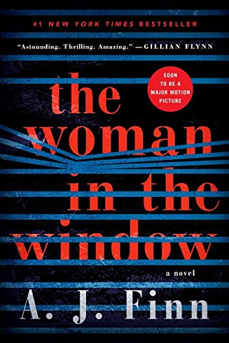
This cover is very simple but it perfectly illustrates and brings the title to life by just adding the thick lines as window blinds.
The artist only used four colors, yet these colors were used perfectly. Black in the background evokes mystery, fear, and anonymity, while the bold red in the title symbolizes attention, courage, and anger.
3. Silent Child by Sarah A. Denzil
The emotion in this cover is overflowing. The use of a bright red raincoat is an excellent way to get the audience’s focus on the book.
I also love how the title’s typography has the texture of the water, so it kind of looks like it’s also submerged together with the object.
Sometimes adding texture to the title can help unify all the elements of the cover, creating one whole, cohesive picture.
4. Billy Summers by Stephen King
This is probably one of my favorite Stephen King book covers. I love how creative the cover is, using a torn page that looks like a road.
It’s almost as if the cover is inviting us to hop in and learn all about Billy’s journey in a dark and mysterious way.
The drop shadows, or the black shading behind the author’s name, add depth to the cover. Adding depth to art is a technique that helps the image appear more realistic. Using red for the trees can symbolize both adventure and danger.
5. Cold Lake by Jeff Carson
I really love the depth of this cover. Unlike the Billy Summers cover, this cover doesn’t use drop shadows, but rather submerges the title in water, with a scratched textures that make it look like it’s part of the wreckage.
Some shades of blue are often used in thriller books because it evokes apathy, depression, and alienation. That’s why the color on this cover really works—it connotes deadly, cold, deep waters.
6. The Shadows by Alex North
This cover is very clean and uses simple, creative imagery that best represents the story. The use of shadows to form a bone can also be a clever way of saying that there are lots of illusions you will read about in the book.
Just like blue, black is often used in thriller covers. Black signifies evil, darkness, and despair. It’s also used to symbolize pain, death, and the unknown. The typography, on the other hand, uses uneven and chaotic letters that add a chilling effect.
7. A Flicker in the Dark by Stacy Willingham
There are so many things that I love about this cover, from the color palette to the font style. But the star of this cover is the typography.
Even as a thumbnail, this cover can easily captivate you with its glowing effect on the title. The use of pointy sans serif font also adds mystery.
Typography is one of the most important elements of any book cover, so it’s important to choose one that fits the genre and tone of the story.
We often see Sans Serif fonts for the title of thriller books, especially Futura, Helvetica, and Gills Sans. These are thick and compelling typefaces that evoke drama and boldness.
8. An Eye for an Eye by Carol Wyer
What I love about this cover is the use of symmetry in the background that compliments the almost-palindrome title to create balance and repetition that follows an identical rhythm. This makes the whole cover feel refreshing to the eyes.
It also uses the pointy sans serif font, same as A Flicker in the Dark. The blurry background also gives off an eerie vibe.
9. Hanging House by Dean Rasmussen
We often see covers with a person’s silhouette, or a character looking at a scene. This is usually a way of telling the readers to follow the journey of that particular character.
This cover, even though it uses the silhouette technique, looks clear and bright yet gives a thrilling vibe because of the imagery and colors used. I also love the visual hierarchy in this cover. It makes the title readable, even though it’s behind some elements.
10. Our Trespasses by Michael Cordell
As I mentioned a while ago, a book cover is just like a movie trailer. It doesn’t have to tell the whole story—it can present just one interesting scene, object, or place.
Out of all the thriller covers I’ve designed myself, this one is my favorite. As with many others on this list, it’s focused on typography. The imagery is simple, with just a mysterious farmhouse and birds on the roof. My main goal here was to evoke a dark tone that hits you as soon as you look at the cover.
Thrilling Cover Designs
Well-designed covers have the power to convey a book’s genre, mood, and themes, all before readers have even finished reading the title. And the best ones will actually make you feel emotions—for thrillers, that’s often fear or excitement.
To discover more iconic book covers, and to see how design trends have changed over time, check out our list of famous book covers and the fascinating stories behind them.
Do you have a favorite thriller book cover? Tell us about it in the comments below!
If you enjoyed this post, then you might also like:
- 19 Famous Book Covers and the Stories Behind Them
- How to Do a Book Cover Reveal: 6 Tips for a Successful Unveiling
- 037: Designing Beautiful Ebook Covers That Sell with Derek Murphy
- The Great Gatsby Book Cover: What’s Behind Those Famous Eyes?

Queenie Faigones is a multimedia artist and aspiring filmmaker. She creates all our art for book cover designs, website graphics, and promotional materials such as posters, GIF animations, videos, and infographics.
Queenie loves to create art that makes an impact, evokes deep emotions, and inspires people to see all the things that we can be thankful for in this world.