When publishing a book, the most important thing is having excellent content. But a very close second is the visual appearance of your book, from cover to cover.
An attractive, clean layout will make your book easier and more enjoyable to read, which increases the chances of readers actually finishing your book.
It’s kind of like interior design—just as a room can look more appealing by being well-arranged and well-organized, the pages of a book can also look attractive—or not.
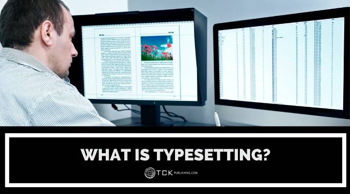
What Is Typesetting?
Typesetting is the process of laying out the contents of a book for print. It is an important process in the fields of graphic design and publishing.
In the past, this involved manually setting up the moveable type per page. (Moveable type was made of metal and it consisted of one letter per block. This made manual typesetting very time-consuming.)
Today, manual typesetting still exists as an artisanal venture and a niche market.
However, moving into the digital age, typesetting shifted to typewriters and finally to computers. Using computers to typeset a document is also known as “formatting.”
Typesetting includes carefully arranging text and images in preparation for printing. Because books are now digitally laid out, typesetters can also be graphic designers (and vice versa).
A key thing to remember is that typesetting is about maximizing visual communication. Think of it as planning a book so that it becomes the easiest and clearest version for your readers to enjoy. This means you’ll need to consider how the fonts look, how readable the font size is, and how to arrange the page so that readers get the best possible experience.
The Difference Between Typesetting and Typography
Typesetting is sometimes confused with typography, but typography actually includes a broader scope, which is described briefly below:
- Setting type (or typesetting): Focusing on paragraphs, lists, captions, and subheads, this involves making the text easy to read and understand.
- Arranging type: Focusing on titles, large headlines, and calls to action, this aims to catch readers’ attention through visual appeal.
- Calibrating type: Giving priority to organization and clarity, this helps readers scan and understand complex details; can include tables, navigation tools, and infographics, among others.
Typesetting is the most important part of typography, because it affects the final visual appearance of pages and spreads in a published document.
Why Is Typesetting Important?
While it’s easy to feel that the writing is all that matters in how a book performs, here are two of the most important reasons why you either need to hire a professional typesetter (also known as a layout designer) or at least pay very close attention to typesetting your self-published book:
Professionalism
When a book is well-designed, it speaks volumes about the author’s (and publisher’s) professionalism and quality.
Amazon boasts a “Look Inside” feature that allows shoppers to see how a book looks before buying it. It’s usually not difficult for readers to spot which books look like a do-it-yourself project, and which look like they were professionally laid out.
Readability
Typesetting also impacts how much the reader will enjoy the book or article. Just as grammatical errors and typos can make your readers cringe, flaws in design can affect how smooth their reading experience is.
Basic Typesetting Terms
To help you understand more about the process of typesetting books, here are some of the most common terms defined for you:
- White space (or negative space): This refers to the space on the page that does not contain text or graphics.
- Book block: This is the tightly-defined area on a page which contains the main text. Facing pages typically end on the same line, except the last page of a given chapter.
- Alignment: Book designers make sure that text lines up across a page, adjusting spacing for headings, subheads, illustrations, and lists.
- Kerning: This is the process of adjusting spaces between characters to make the page look better.
- Line spacing: This refers to the distance between lines of text. Finding the right line spacing makes for an easier reading experience.
- Paragraph spacing: Paragraphs typically do not have space between them, with an indentation introducing the start of a new paragraph instead.
- Margins: This refers to the white space around the book block. Margins give the eyes space to rest, while also giving space for the reader to hold the book.
- Widows and orphans: Widows refer to the last line of a paragraph that ends up on the next page; orphans refer to the first line of a paragraph that forms the last line on a page. Both are avoided when possible during the typesetting process.
How to Typeset a Book
You have two options for typesetting your book: you can hire a professional typesetter, or do it yourself. If it’s your first time, hiring a professional typesetter can help you see how things should look, but it still depends on your budget.
Working with a Professional Layout Designer
Hiring a professional typsetter can cost anywhere between $500 to $2,000, depending on the typesetter’s experience. Clearly, more experienced designers can help you make your book look professional, but you need to understand a few things:
1. Make sure your typesetter is familiar with your book genre.
Different genres call for different looks. Your typesetter needs to understand the basic requirements for the genre of your book so that he can stay within the expected boundaries.
2. Ask for samples of their work.
Don’t be shy to ask a potential typesetter for samples of their previous work. This will give you a clear idea of their output. Be sure to ask for several samples so you can see how they typeset different kinds of books.
3. Scrutinize his sample work from a reader’s perspective.
The best way to tell if the typesetter succeeded in his job is this: is the text comfortable to read? Go through his sample work not as a potential employer but as a reader. Does anything make you stumble or confused? Did he put any extra ornamentation that distracts, or does it help cement what the content is about?
4. Don’t be afraid to ask questions.
Although you will be hiring a professional typesetter, it’s always a great idea to educate yourself on what should be done. Then, don’t be afraid to ask your potential typesetter questions. Building a relationship of open communication will go a long way in helping you work with your typesetter in a more relaxed atmosphere.
DIY Typesetting Programs
If you choose to do it yourself, having the right software can make the process easier. While it’s possible to print a good-enough looking book using MS Word or MS Publisher, many experts discourage you from using Microsoft Word for typesetting, because it can only do so much.
Instead, here are some software that can help you do your typesetting job:
LaTeX
LaTeX is a free typesetting software gives you advanced control over typesetting, letting you format nonfiction books that have cross-references, tables, footnotes, and even figures. As an open-source system, though, LaTeX requires you to be knowledgeable in coding in order to maximize it for your use.
Adobe InDesign
Adobe InDesign is a favorite among professional designers, letting you format paragraphs, stylized drop caps, and even complicated kerning which will take ages to do in MS Word. It’s also a great choice for books that have plenty of illustrations.
But the program has a steep learning curve, and a relatively steep price, too, of $239. Fortunately, the program lets you have a one-month free trial.
If you choose to use Adobe to lay out your book, be sure to check out our InDesign tutorial!
Reedsy Book Editor
This one-click tool makes it easy for you to format books and make them look professional. Plus, it’s free to use!
Typesetting Tips
These basic typesetting rules should help you get started with creating a visually-appealing book:
1. Use Serif and Sans-Serif fonts appropriately.
Serif fonts are those that come with the decorative stroke at the ends of a letter, such as Times Roman. Sans serif fonts are those that do not come with this stroke, with sans meaning “without.”
Serif fonts make reading easier because the stroke leads the reader’s eye over to the next letter, making it easier to follow along the line. The same line printed in sans serif is more tiring for the reader’s eye.
With this in mind, sans-serif fonts are best reserved for limited use, such as headings. The body of the text will be easier to read in a serif font.
2. Pick a full package font.
A full package font is one that comes in italics, bold, italic bold, and also has full symbols like copyright symbols and em dashes. One example of a full package font is Garamond.
You definitely don’t want to spend hours typesetting only to find out that the font you chose is missing something like the em dash, so be sure to do your research before starting.
3. Don’t use too many different fonts.
Although different typefaces can help make your book visually appealing, changing them too many times will end up cluttering your page. Keep your fonts consistent.
Sometimes book publishers use a font from the cover page for the inside content, but only as routine-busters, such as using it as the first letter in a chapter.
4. Avoid orphans and widows when possible.
These hanging single lines make the large sections of text appear messy and unbalanced. That’s why typesetters make sure to avoid having widows and orphans in books whenever possible.
Some programs already have a setting to fix widows and orphans, but otherwise, it may be necessary to manually adjust the text in order to keep paragraphs together.
5. Never stack the same words on top of each other.
When the same word or words are stacked directly on top of each other, it tends to confuse readers as to which line they are reading. This can usually be fixed by adjusting the spacing between words or letters, or actually editing a word or two.
6. Give your book enough white space (negative space)
White space helps your readers by giving their eyes space to rest. Chapters usually start on the right side of a spread, giving you white space on the left and at the top of the chapter.
Typesetting Your Book for Print and Ebook
Lastly, remember that typesetting your book for print and for ebook can be two totally different processes.
Typesetting ebooks includes many other rules simply because e-readers change font sizes according to the reader’s preference. Here is a guide to help you learn more about formatting your book for Kindle.
Did you find this post helpful? Let us know in the comments below!
If you enjoyed this post, then you might also like:
- Proofreading Your Book Post-Layout: How Editing After the Edit Can Save Your Story
- 7-Step InDesign Tutorial for Book Layouts
- 6 Keys for Book Page Layout: Don’t Ignore These Design Rules If You’re Self-Publishing
- 10 Best Websites for Downloadable Fonts
Yen Cabag is the Blog Writer of TCK Publishing. She is also a homeschooling mom, family coach, and speaker for the Charlotte Mason method, an educational philosophy that places great emphasis on classic literature and the masterpieces in art and music. She has also written several books, both fiction and nonfiction. Her passion is to see the next generation of children become lovers of reading and learning in the midst of short attention spans.

What is the term for, on a book page, when white space between words on adjoining lines seem to connect to form straight or slanted white space lines vertically on the page – like a simple path or maze?